FoodEase
A Figma food delivery mobile app concept focused on visual appeal, simple browsing, and a clear ordering flow.
Technologies Used
Project Info
- Status
- Completed
- Difficulty
- Easy
- Created
- Updated
FoodEase
CASE STUDY / UI/UX DESIGN
FoodEase is a food delivery mobile app concept designed in Figma. The project focuses on making food browsing and ordering feel simple, visually engaging, and easy to understand from the moment a user opens the app until an order is completed.
Unlike my development projects, FoodEase is primarily about UI/UX design and visual decision-making: color, spacing, typography, imagery, hierarchy, and the structure of the ordering flow.
Overview
01 / PRODUCT DIRECTION
Food ordering interfaces contain a lot of information at once: food images, categories, prices, promotions, ratings, delivery details, and order summaries. The design challenge was to present this information without making the interface feel crowded.
Simple to understand
Keep the next useful action clear from the first screen onward.
Visually appealing
Use food imagery and controlled color to make browsing inviting.
Easy to scan
Organize dense content into clear visual groups and short labels.
Consistent
Reuse spacing, buttons, typography, icons, and card patterns across screens.
Design Philosophy
02 / VISUAL PRINCIPLES
The food itself is the visual focus. Rather than filling each screen with decoration, the interface creates a clear hierarchy around the user's decision-making process.
- First question
- Where am I?
- Second question
- What can I choose?
- Third question
- What am I ordering?
- Fourth question
- How much does it cost?
- Final question
- What happens next?
Large food imagery, short labels, clear buttons, and structured sections let users scan the experience instead of reading every detail line by line.
Designing the User Flow
03 / ORDERING JOURNEY
Starting Page
The opening screen introduces FoodEase with a simple logo, illustration, short description, and login action. The layout stays minimal because users do not need much information yet; the goal is to introduce the product and provide a clear starting point.
Browse Products
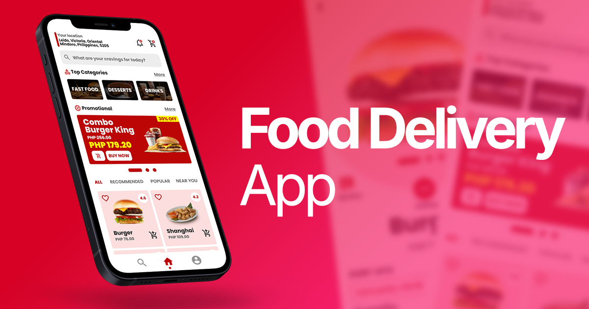
The main browsing experience introduces search, food categories, promotional content, recommended products, popular food, and navigation. The layout becomes denser, so spacing and grouping separate the sections instead of letting the screen become one large block.
Product Details
The product page gives one item the user's full attention. A large burger image leads the screen, supported by the product name, rating, add-ons, quantity, price, and add-to-cart action.
Checkout
Checkout changes the visual priority from exploration to confirmation. The interface emphasizes ordered items, quantities, prices, delivery information, payment information, order total, and the place-order action.
Order Confirmation
The final screen creates a clear completion state through a “Thank you” message and illustration. The order summary remains visible underneath so the user can confirm what was ordered and the final amount.
Color Psychology
04 / RED, WHITE, AND PINK
Red
Used for important actions, prices, promotions, and selected states. It creates energy and attention without covering the entire interface.
White
Provides the main background and creates contrast for food imagery and red actions.
Light pink
Adds warmth and friendliness, especially in the confirmation experience.
- Red
- Attention and action
- White
- Clarity and space
- Pink
- Warmth and friendliness
Food Imagery as UI
05 / VISUAL FOCUS
Food is inherently visual, so users should recognize products quickly without relying only on names. On the product detail screen, the burger image is a primary element rather than a small thumbnail.
- First
- Food image
- Second
- Product information
- Third
- Options and quantity
- Fourth
- Price and action
Visual Hierarchy
06 / GUIDING ATTENTION
- The food image attracts attention first.
- The product name identifies the item being viewed.
- Ratings and options provide supporting decision information.
- Price and purchase actions become most important near the bottom.
The interface does not make every element equally noticeable. It tells the user what deserves attention first, second, and third.
Layout and Spacing
07 / GROUPING CONTENT
Whitespace separates sections and prevents the browse screen from feeling dense. The layout creates a readable rhythm between categories, promotion, recommended or popular food, and bottom navigation.
- Categories
- Promotion
- Recommended and popular food
- Bottom navigation
Cards and Content Grouping
08 / COMPARING PRODUCTS
Food products are presented as individual visual units so users can compare them without reading through a long list. Each card combines the food image, product name, rating, price, and short supporting information.
Buttons and Calls to Action
09 / MOVING FORWARD
Login
Starts the authenticated experience.
Add to Cart
Moves a selected product into the order.
Buy Now
Moves the user toward purchase.
Place Order
Completes the checkout journey near the final total.
Typography
10 / COMMUNICATING IMPORTANCE
Stronger weights identify product names, section headings, prices, and order totals. Smaller and lighter text supports the primary information. This creates hierarchy without requiring many font styles, which is especially important on a mobile interface.
Navigation
11 / PERSISTENT ACCESS
The browse screen uses bottom navigation to keep the main areas of the application accessible without taking much vertical space. The selected item is visually emphasized so users know where they are.
Consistency Across Screens
12 / ONE PRODUCT LANGUAGE
Spacing
Repeated spacing patterns make the screens feel related.
Buttons
Actions use a consistent visual treatment.
Color
The red accent is reused intentionally.
Typography
The hierarchy remains recognizable across tasks.
Icons and cards
Repeated treatments create a coherent design system.
Designing for the User Journey
13 / DIFFERENT STAGES, DIFFERENT PRIORITIES
- Starting
- Simplicity and introduction
- Browsing
- Discovery and visual appeal
- Product details
- Information and decision-making
- Checkout
- Clarity and accuracy
- Confirmation
- Reassurance and completion
What I Avoided
14 / RESTRAINT
- Too many competing colors.
- Large amounts of unnecessary text.
- Excessive borders and decorative elements.
- Too many competing buttons.
- Inconsistent card designs.
The goal was not to make every element stand out. The goal was to make the right elements stand out.
Design Trade-offs
15 / BALANCING THE INTERFACE
Visual appeal ↔ information
Larger food images are attractive and recognizable, but use more screen space.
Simplicity ↔ functionality
Fewer visible choices are easier to scan, but may hide useful detail.
Whitespace ↔ content density
More space improves readability, while less space shows more products.
Brand personality ↔ usability
Color and warmth should support the task rather than compete with it.
What I Learned
16 / REFLECTION
FoodEase reinforced that UI design is not only about making screens look good. A visually attractive interface still needs to communicate clearly.
- Why an element needs to be large or small.
- Why accent colors should be used selectively.
- How whitespace affects readability.
- How imagery influences visual hierarchy.
- How users move from one screen to another.
- Why different stages of a flow require different layouts.
- Why consistency matters across an entire product.
Design Focus
- Focus 01
- UI/UX Design
- Focus 02
- Visual Hierarchy
- Focus 03
- Color and Typography
- Focus 04
- Mobile Interface Design
- Focus 05
- User Flow
- Focus 06
- Layout and Spacing
- Focus 07
- Figma
Conclusion
FoodEase was a visual and UX exploration of a complete food-delivery experience. From the first screen to order confirmation, the design connects visual appeal with hierarchy, spacing, color, typography, and clear user actions.